Your child wants to study business management. That's excellent. But what exactly will they learn? More importantly, what skills will actually help them succeed twenty years from now? Business schools throw around terms like analytics, data science and visualisation. Parents often nod along without fully grasping what these mean or why they matter. Here's the truth: businesses today drown in data. Sales figures, customer behaviour, market trends, competitor movements—it's overwhelming. Raw numbers mean nothing if nobody can interpret them quickly. That's where data visualisation comes in.
It transforms spreadsheets full of figures into charts, graphs and dashboards that reveal patterns instantly. Your child won't just learn to create pretty graphs. They'll learn to spot opportunities, identify problems and make decisions that affect millions in revenue. This isn't optional anymore. It's fundamental to modern business management, which is precisely why leading institutions prioritise teaching it properly.
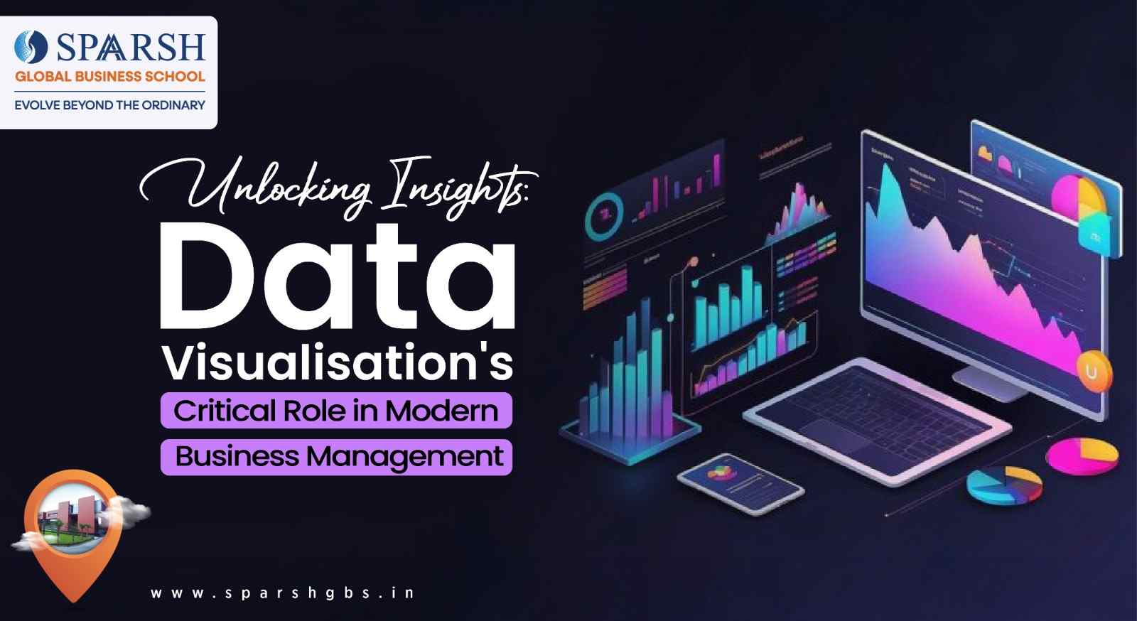
What Data Visualisation Actually Means
Let's start simple. Data visualisation converts numbers into visual formats. Bar charts. Line graphs. Heat maps. Pie charts, though professionals use those sparingly now. The goal isn't decoration. It's clarity.
Imagine reviewing last quarter's sales across fifty regions. A spreadsheet with 2,000 rows of numbers? You'll spend hours finding patterns. A colour-coded map showing performance by region? You'll spot the problems and successes in seconds. That's the power of good visualisation.
Business students learn various tools. Excel remains relevant despite being decades old. Power BI has become industry standard. Tableau offers advanced capabilities. Python libraries like Matplotlib serve technical roles. At Sparsh Global Business School, students master multiple platforms because different organisations prefer different tools.
Why Managers Can't Function Without It
Decision-making speed matters enormously in business. Markets shift overnight. Competitors launch products unexpectedly. Customer preferences change rapidly. Managers need insights fast, not next week.
Data visualisation enables this speed. A well-designed dashboard shows key performance indicators at a glance. Revenue trends. Inventory levels. Customer acquisition costs. Employee productivity metrics. Everything that matters, visible immediately.
But speed without accuracy is dangerous. Poor visualisations mislead. A badly scaled graph might suggest sales are booming when they're actually declining. Students at SGBS learn to create honest visualisations that reveal truth rather than support preferred narratives.
Real Business Applications Your Child Will Master
Theory matters as much as application. Business management students need practical skills they'll use from day one in their careers.
Marketing departments rely heavily on visualisation. Campaign performance tracking requires it. Which social media platform drives conversions? What demographics respond to specific messages? Heat maps show website visitor behaviour. Funnel charts reveal where potential customers drop off. These aren't abstract concepts. They're daily tools.
Finance teams live in dashboards. Budget versus actual spending. Cash flow projections. Profit margins by product line. Risk assessments. Financial visualisations need precision because errors cost money—sometimes millions.
Operations management uses visualisation for efficiency. Supply chain tracking. Production bottlenecks. Quality control metrics. Delivery performance. When Amazon shows you where your package is, that's data visualisation at work.
Human resources increasingly depends on people analytics. Employee turnover patterns. Recruitment funnel efficiency. Training effectiveness. Diversity metrics. Modern HR isn't just about hiring and firing anymore.
The Skills That Actually Get Jobs
Employers don't care much about degrees alone. They want capabilities. SGBS understands this, which is why the curriculum focuses on job-ready skills.
Students learn to ask the right questions before creating any visualisation. What decision needs making? Who's the audience? What level of detail do they need? A CEO wants different information than a warehouse manager. Good visualisation matches the viewer's needs.
Technical proficiency matters but isn't everything. Creating a chart in Power BI takes a few clicks. Creating the right chart requires understanding business context. Students practise both. They work with real datasets from actual companies. They present findings to panels of industry professionals who provide brutally honest feedback.
Storytelling through data becomes second nature. Numbers don't speak for themselves despite what people claim. A chart showing declining market share means nothing without context. Why is it declining? What can we do? What happens if we don't act? Students learn to build narratives around data that drive action.
Common Mistakes Students Must Avoid
Too much information ruins visualisations. Cramming every possible metric onto one dashboard creates confusion rather than clarity. Students learn the art of selective presentation—showing what matters, hiding what doesn't.
Misleading scales represent another trap. Starting a bar chart's y-axis at 50 instead of 0 exaggerates differences. Intentional or not, it's dishonest. Business ethics applies to data presentation too.
Choosing wrong chart types happens frequently. Pie charts with twelve slices? Unreadable. 3D graphs? Usually unnecessary and often confusing. Line charts for non-sequential data? Wrong application. SGBS teaches students to match visualisation types to data types automatically.
Ignoring colour-blind accessibility affects roughly 8% of men and 0.5% of women. Using red-green combinations excludes these viewers from understanding your data. Professional visualisations consider accessibility from the start, not as an afterthought.
How This Prepares Students for Leadership
Junior managers execute tasks. Senior managers make strategic decisions. Data visualisation skills accelerate that journey from execution to strategy.
Understanding data deeply builds confidence. When your child can analyse market trends, spot operational inefficiencies or predict customer behaviour, they become valuable quickly. Promotions follow performance and data literacy drives performance.
Cross-functional communication improves dramatically. Finance people speak one language. Marketing speaks another. Operations has its own jargon. Data visualisation becomes the common language everyone understands. Your child will facilitate conversations between departments that previously talked past each other.Risk management becomes more sophisticated. Visualising various scenarios helps businesses prepare for uncertainties. What happens if our main supplier fails? How do different pricing strategies affect profit margins? Scenario modelling through visualisation makes these questions answerable.
Connecting Classroom to Boardroom
Business schools often struggle with relevance. Students learn theories that don't translate to actual work.SGBS tackles this through industry partnerships. Guest lectures from chief data officers. Live projects with real companies. Internships where students build actual dashboards that organisations use.
Embracing Resilience and Iteration
The feedback loop matters enormously. Students create visualisations. Industry mentors critique them. Students revise. This perfectly mirrors the dynamics of the actual workplace, where it's exceedingly rare that a first draft is ever truly sufficient for the task at hand. What happens here is that both resilience and the essential habit of iteration become ingrained practices, rather than remaining mere abstract concepts to be memorised.
The additional value gained from experience in a competitive setting simply serves to sharpen those skills further still. Business analytics competitions pit students against peers from other institutions. Real datasets. Real problems. Judged by industry professionals. Winning matters less than the preparation and learning process.
Final Thoughts
Data visualisation in modern business management isn't a specialty skill anymore. It's foundational, like accounting or finance. Your child will encounter it regardless of which business area they enter. Marketing, operations, finance, human resources—all depend on visual data interpretation. Institutions like SGBS offering a PGDM Program in Noida recognise this reality and structure their curricula accordingly. They're not just teaching your child to make graphs. They're teaching them to see patterns, communicate insights, and drive decisions that matter—skills that truly transform business students into business leaders.
Frequently Asked Questions
Q1. Does my child need strong Mathematics skills for data visualisation in business management?
Basic Mathematics suffices for most business applications. Your child needs to understand percentages, ratios, averages and growth rates—concepts covered thoroughly in school. Advanced Mathematics helps with statistical analysis, but business management programmes teach necessary statistical concepts from scratch. The bigger requirement is logical thinking. Can they spot patterns? Do they question anomalies? Critical thinking matters more than calculus. Many successful business analysts struggled with advanced Maths in school but excel at data interpretation because they understand business context. SGBS focuses on applied skills rather than theoretical Mathematics, which makes the subject accessible to students from various backgrounds.
Q2. Will learning specific software tools become outdated as technology changes?
Tools change constantly. Power BI dominates now. Something else might dominate in five years. That's why proper business management education teaches principles alongside tools. Understanding what makes a good visualisation transcends any specific software. Your child learns to evaluate data, choose appropriate representations and communicate findings clearly. These skills transfer across platforms. They'll learn current industry-standard tools for immediate job readiness. But more importantly, they'll understand underlying concepts that let them adapt to whatever tools emerge next. Companies value this adaptability. They can train someone on new software in weeks. Teaching them to think analytically about data takes years.
